Case Study

First-Generation Startup

A novel AI-driven business model, connecting service providers with B2B and B2C customers through a conversational user interface.

Currently seeking Series A seed funding and venture capitalist support. This material is approved for public consumption.

Prototyping with Figma

Hypotheses

An industry subject matter expert has developed hypotheses identifying an undiscovered market opportunity. It is hypothesized that by leveraging advanced technology (artificial intelligence) and redesigning both the revenue structure and user experience, we expect to provide increased value to customers while also unlocking significant business revenue streams.

Challenge

1.) Produce a clickable MVP prototype that will articulate the new business model’s digital experience from a buyer perspective.

2.) Use prototype to conduct moderated cognitive walkthroughs and document buyer reactions and verbatim.

3.) Secure venture capital Series A seed funding for Phase I development.

Approach

The plan is to include research early and often in order to pivot the business model around buyer feedback ensuring the UCD (user centered design) approach is respected.

Plans to begin user research and validation efforts are being coordinated.

Outcomes

At the time of this writing, we have received venture capitalist feedback on the business plan suggesting the experience will need to incorporate more artificial intelligence in order to gain VC interest.

The material included in this case study is in response to that feedback.

Discovery & Arresting Abstraction

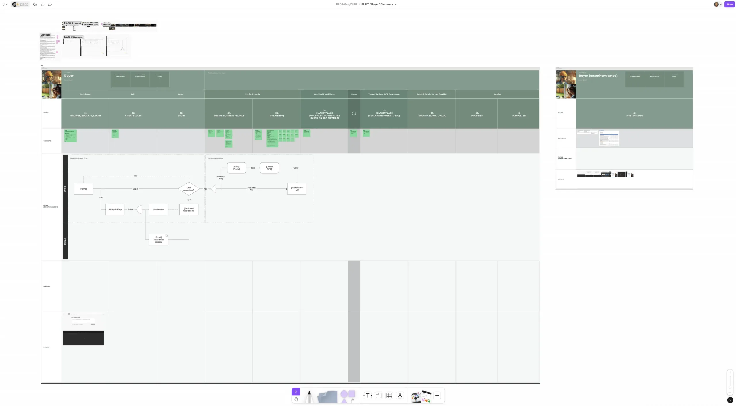
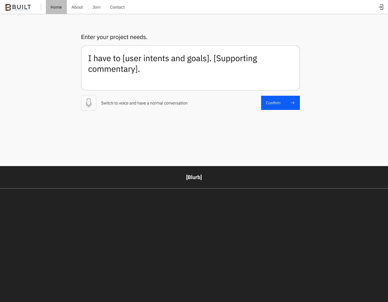
I began by diving into the provided design brief and PRD to structure the conceptual framework and user experience paradigm from the perspective of an anonymous (not logged in) Buyer. This entails translating the business hypotheses outlined in these documents into tangible user experience artifacts, such as flow diagrams, site maps, customer journey maps, archetype and persona definitions as well as defining loose criteria for the artificial intelligence layer. I undertook this task before conducting primary user research, as the scientific method permits informed speculation before experimentation.

Leveraging the collective knowledge of the team, we’ve initiated Iteration 0 relying on a broad range of assumptions and educated guesses. At the right time, these assumptions will be scrutinized through a rapid user research program, providing insights into user perceptions of the proposed experience and the underlying business strategy that drives it all.

Iteration 0: Proof-of-Concept

“In business, abstraction can lead to detachment from the core principles that drive success.” – Richard Branson
First generation, proof-of-concepts are nothing more than educated guesses made by subject matter experts. And that’s ok. Experience design is more about practicing the scientific method than it is about producing fine art. If we want to call it “art” we must dismiss the cost and time it takes to produce it, the value it brings to other people and results the work generates.

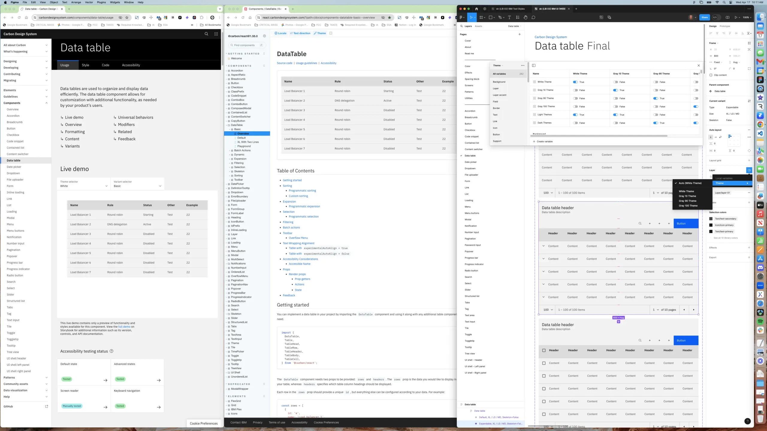
Figma & IBM Carbon

Work smarter. Not harder. After some deliberation, our small team of 4 made a strategic decision to harness the power of IBM Carbon (an open-source design system), steering clear of the tedious task of building a design system from scratch. With Carbon’s wealth of resources, including comprehensive documentation, an interactive (React) Storybook, and a full suite of Figma libraries, I can push forward addressing the important matter at hand – alignment.

As the designs evolve based on user feedback and insights, I will be poised to introduce new and fresh patterns that will augment and elevate Carbon’s out-of-the-box patterns and controls allowing us to ultimately deliver a truly unique and branded experience. Additionally, the choice to exploit an open-source system means we achieve a level of accessibility compliance on day 1.

Quick note: Tone-of-voice and content copy exercises have not yet been conducted. For those of you that turn their noses up to lorem ipsum placeholder text… get over it. Besides, adding content could reveal too much about the target audience and business model.

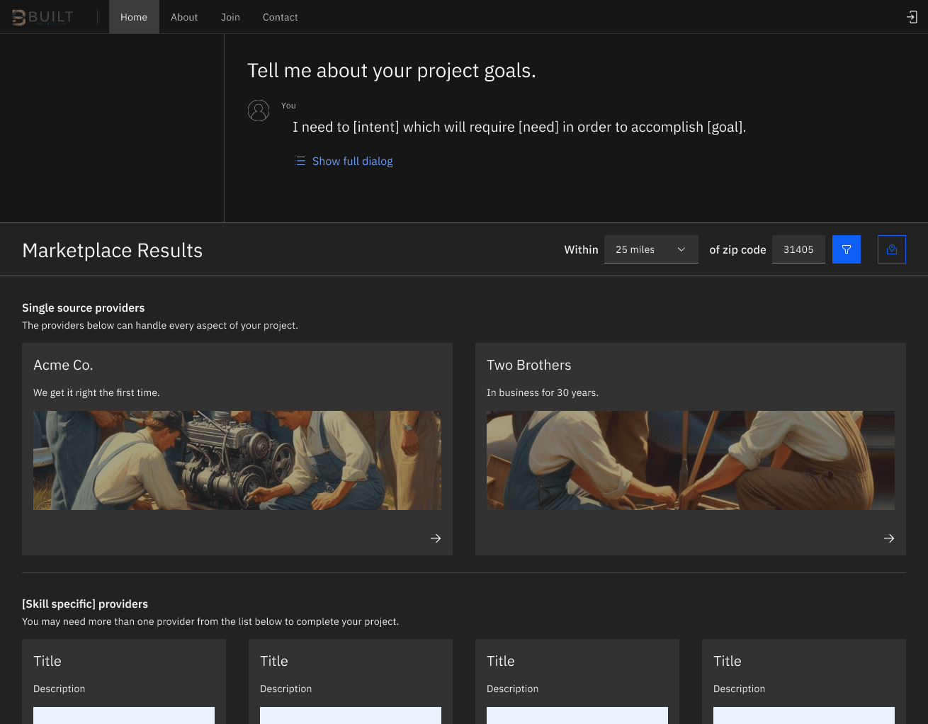
Page Shell: Anatomy
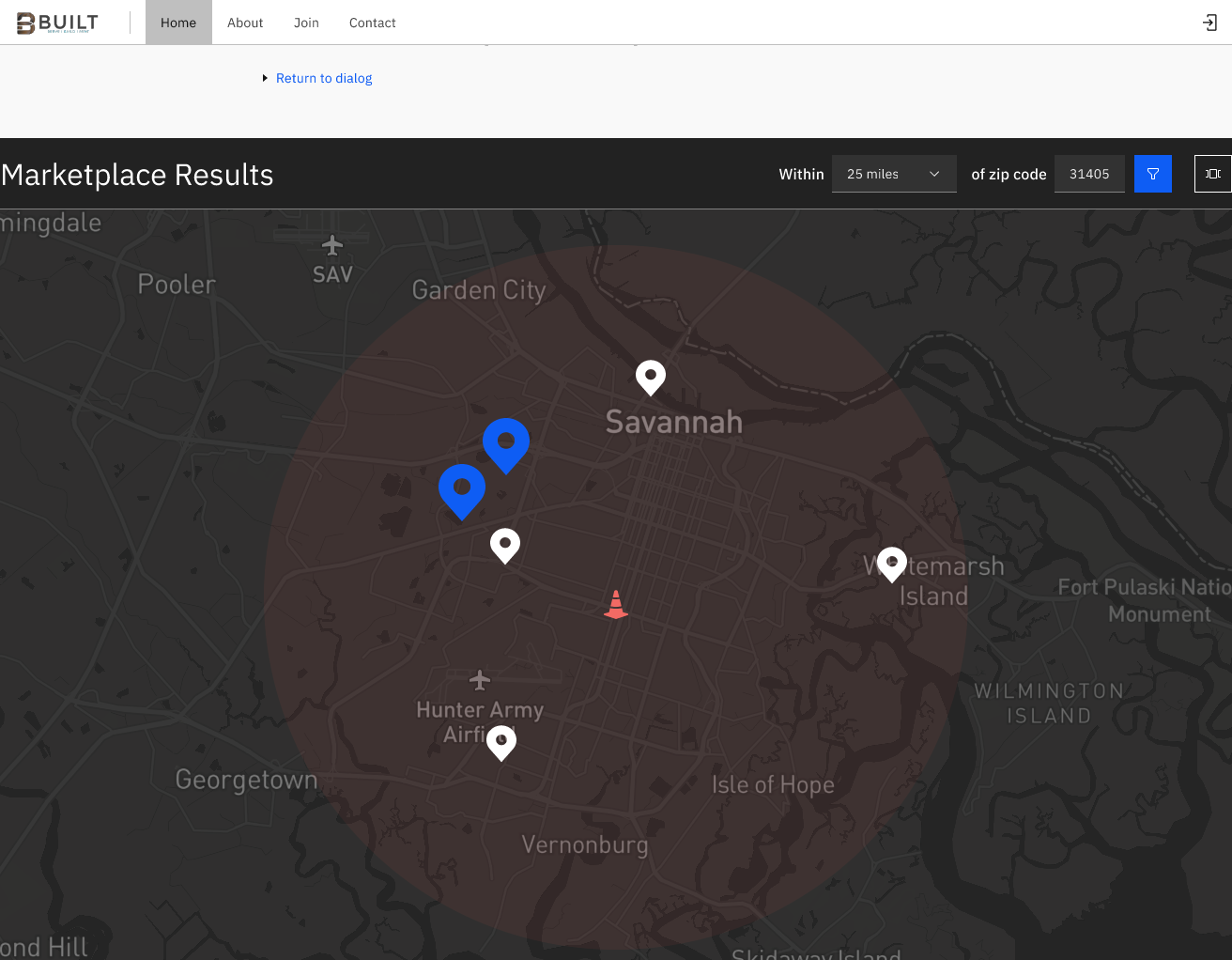
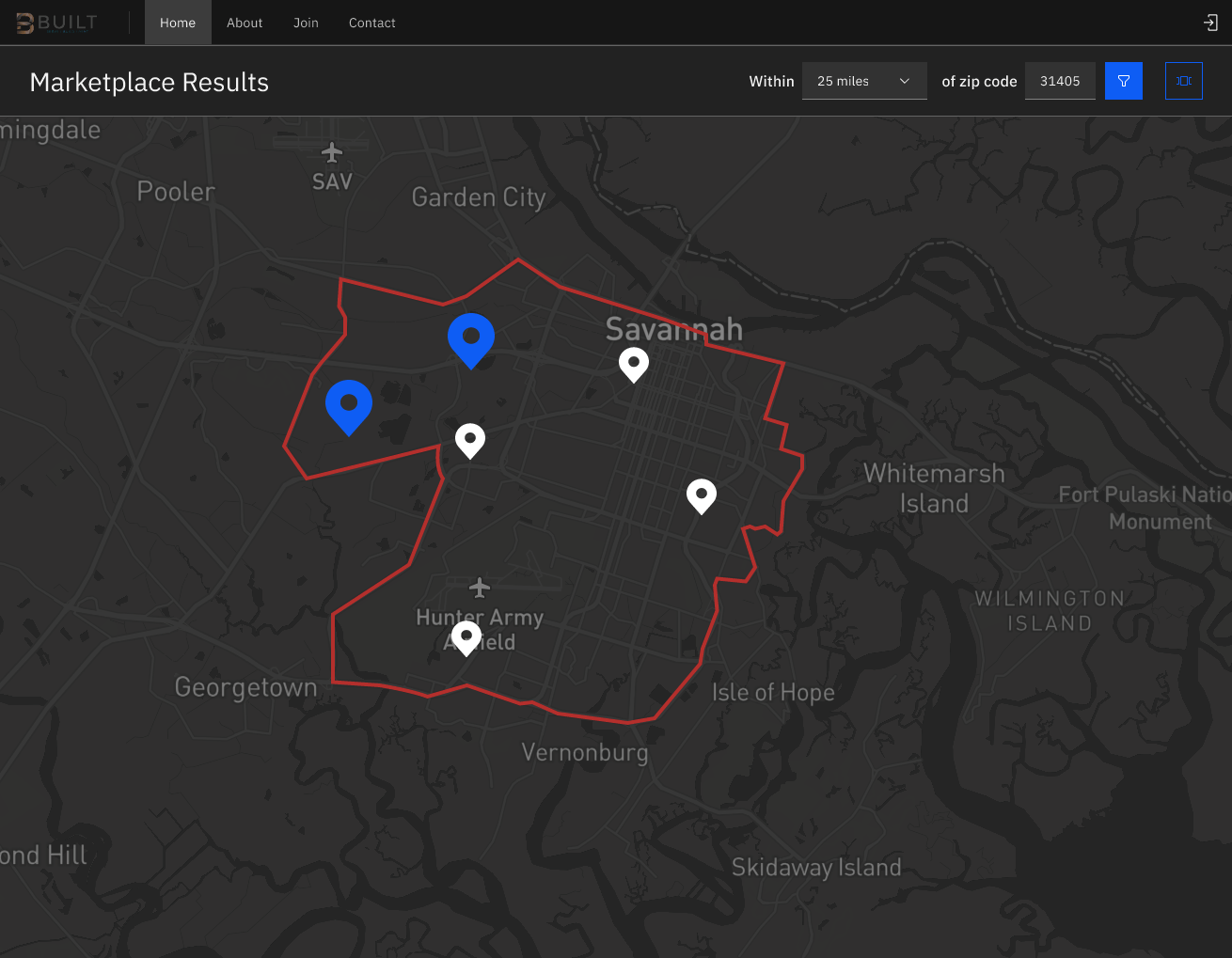
Console: Anatomy
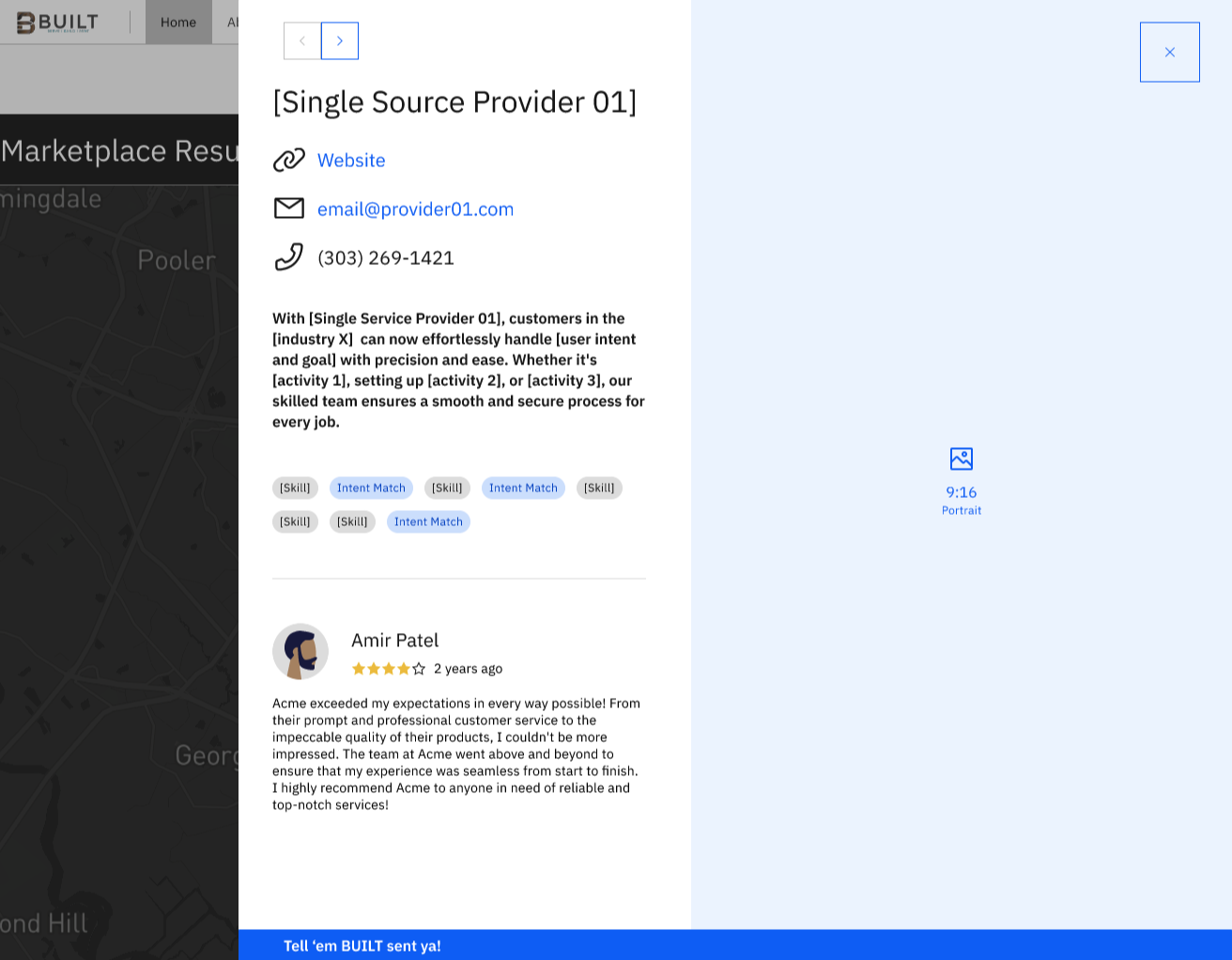
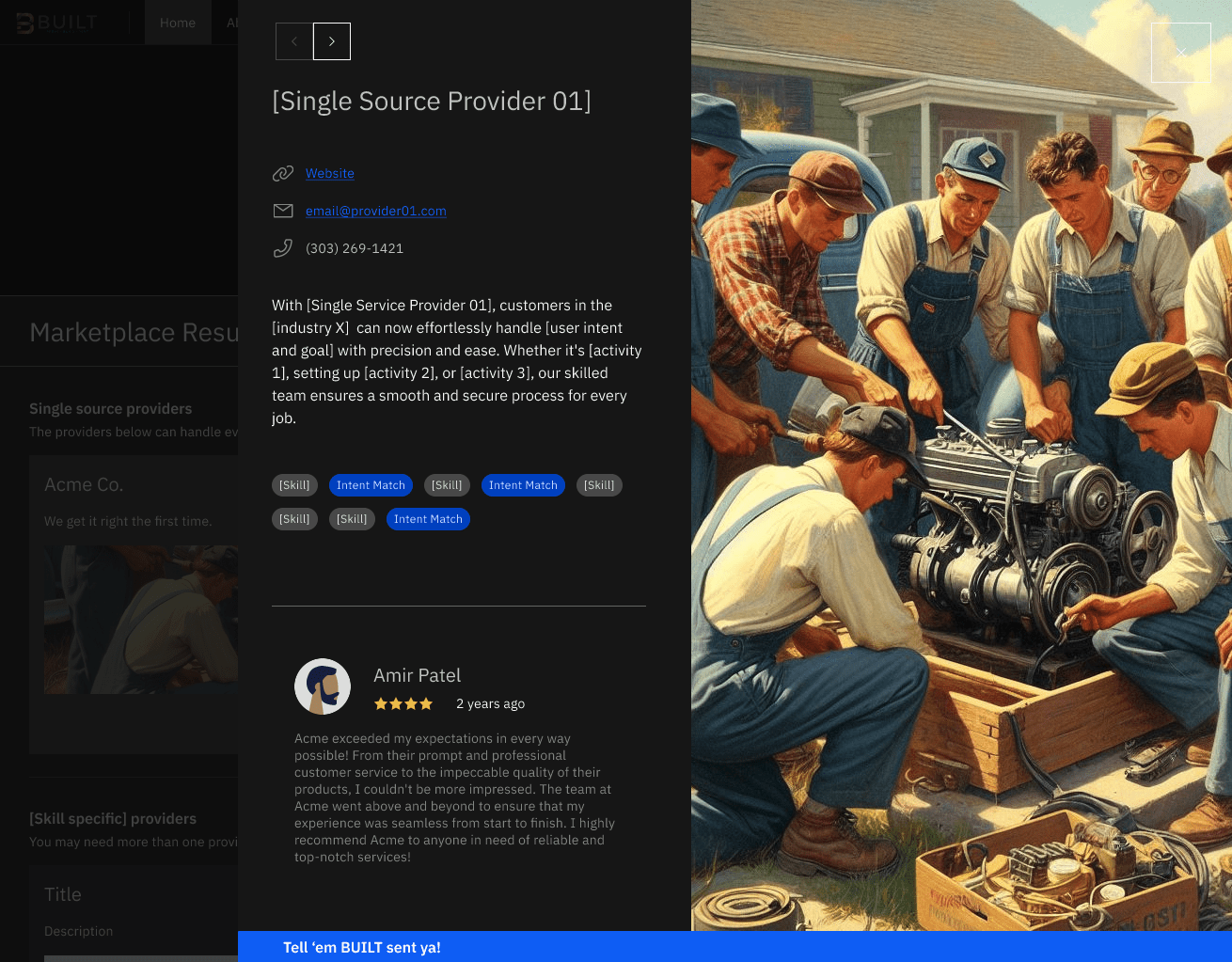
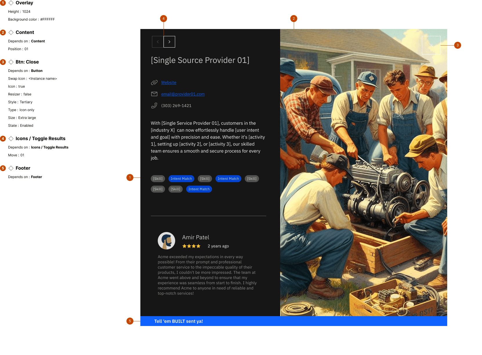
Overlay: Anatomy
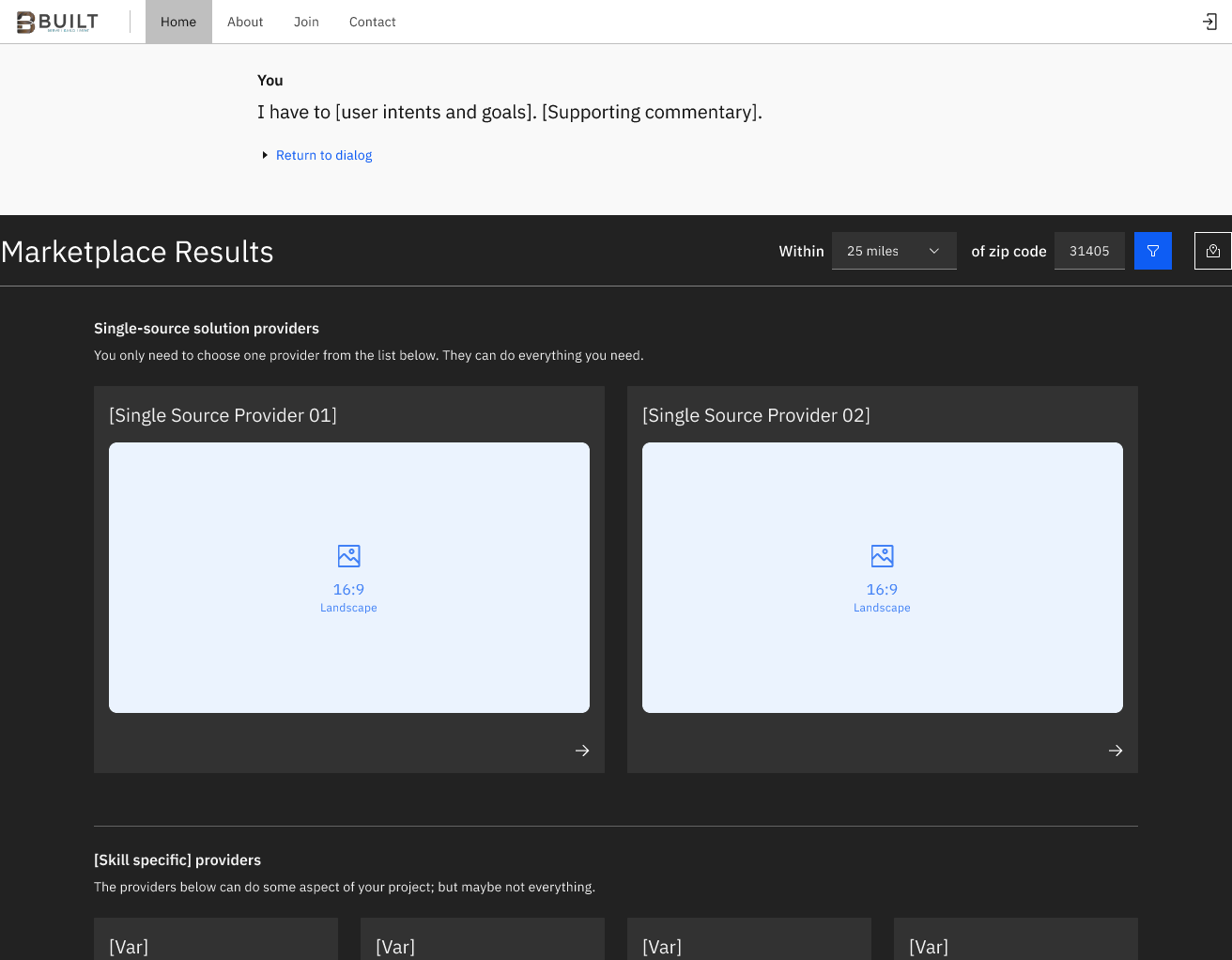
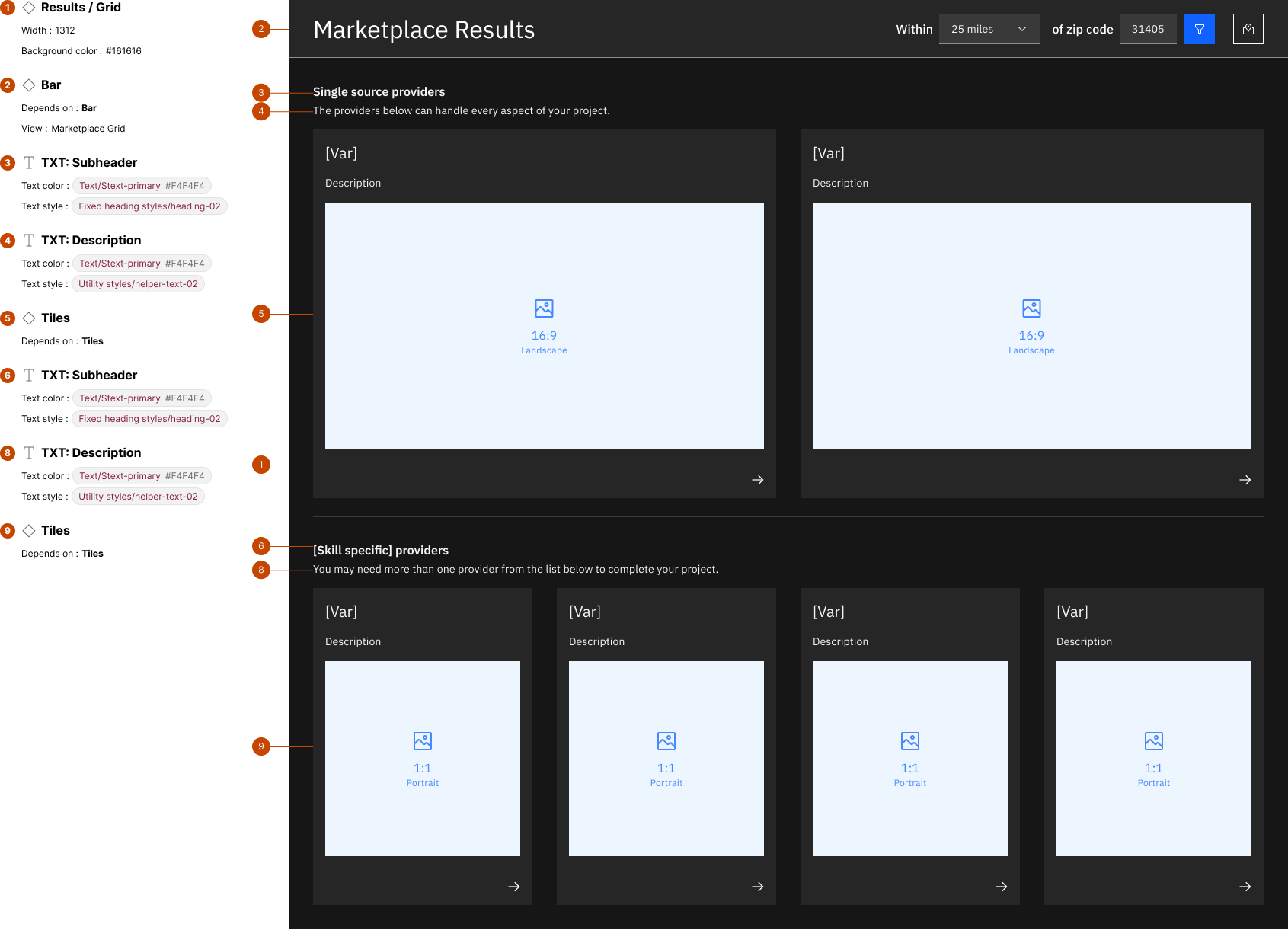
Results Grid: Anatomy
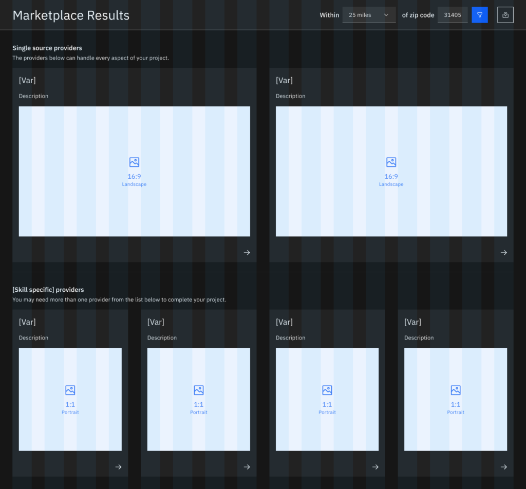
Results Grid: Responsive Layout

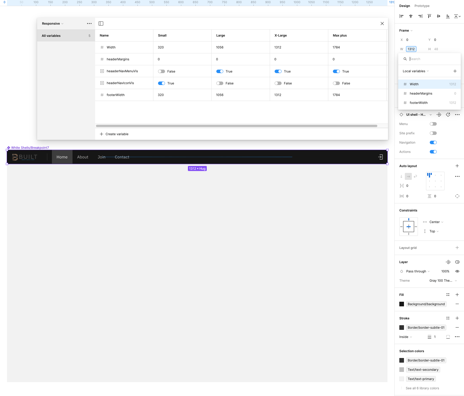
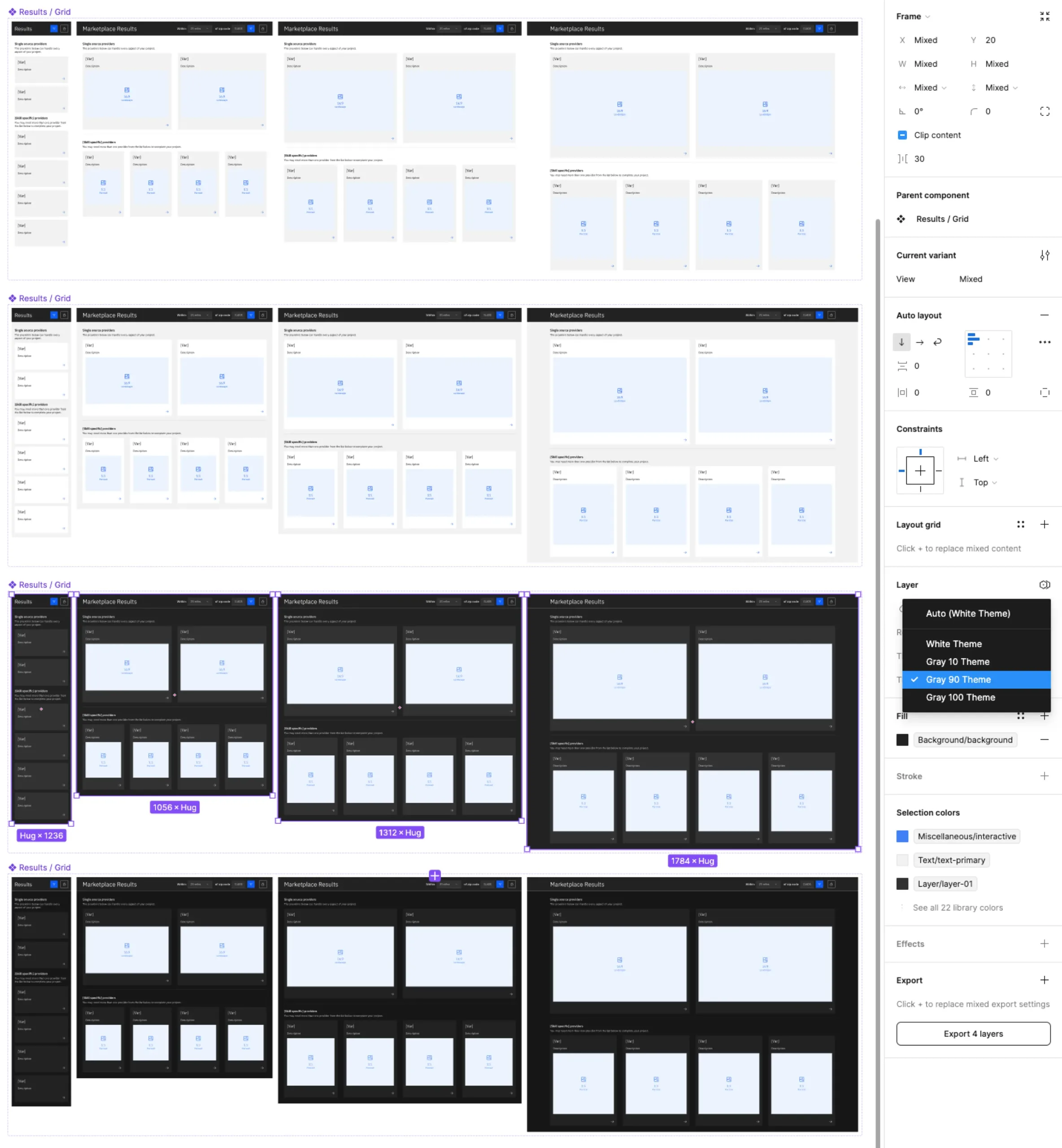
The IBM Carbon design system implements an 2x grid with an 8px mini unit of measure. As such, the 5 different breakpoints that are available out of the box are all divisible by 8 (or factors thereof) which affords a symmetrical canvas to design upon. The IBM Carbon breakpoint system favors symmetrical canvases over targeting hardware devices and their respective viewport sizes. This means you can actually achieve symmetrical tile layouts using this system.

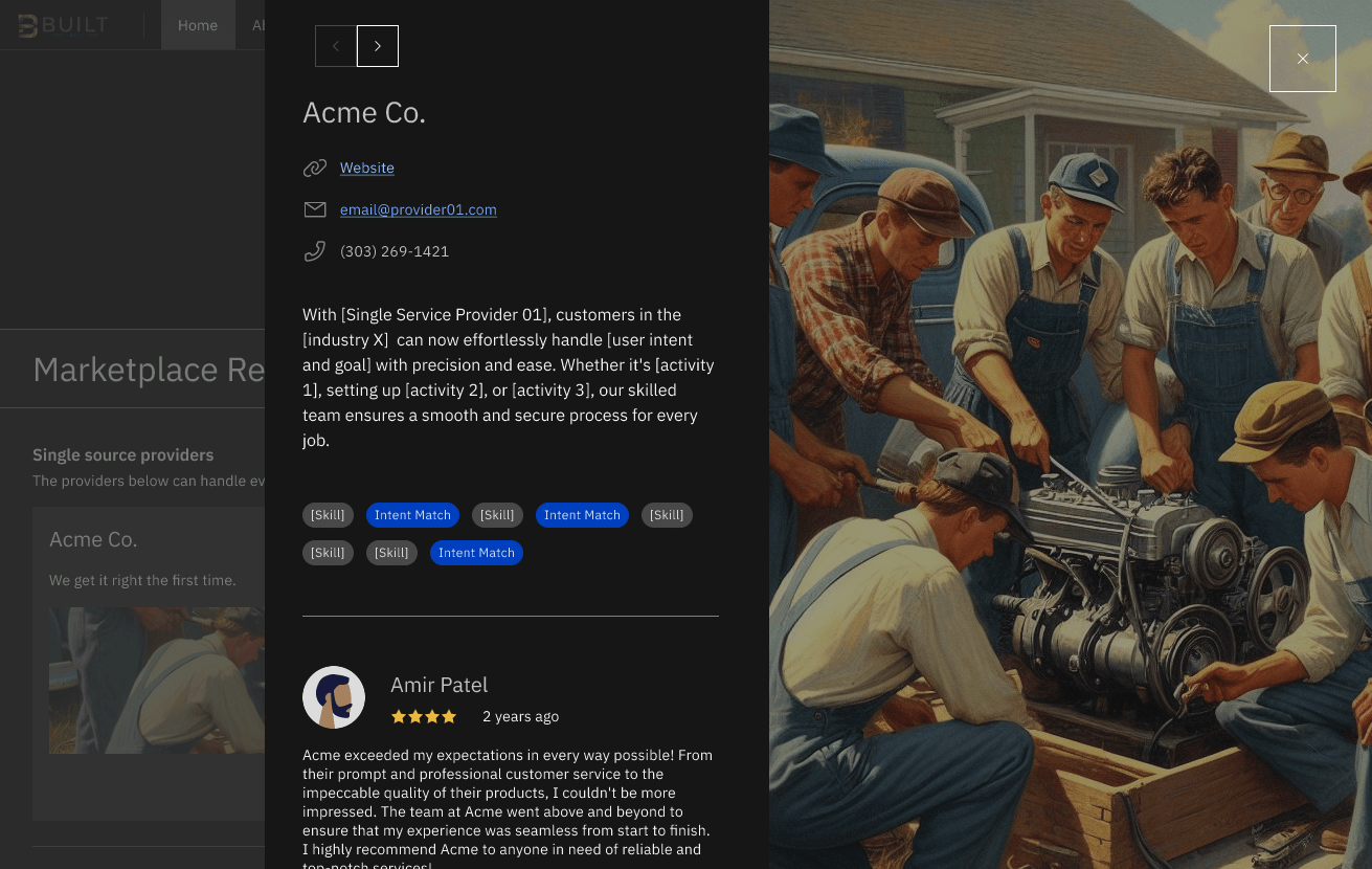
Results Grid: Color Themes

Carbon offers 4 color mode themes out of the box. As I construct the Iteration 0 paradigms and prepare for user evaluation exercises, I will take a few moments to bind patterns and user interface parts to those color themes. This ensures that as I iterate on the designs over time, I don’t wander away from value add possibilities Carbon offers out of the box (e.g. light and dark modes). For this project, I prefer to connect controls and patterns to themes now rather than after getting user feedback.

VIDEO SERIES
VIDEO SERIES