Case Study

Product Tile Design

Defining enterprise product tile design standards for high-traffic eCommerce.

My product tile (and product list page) redesigns positively and directly impacted click-through rates, conversion rates and revenue.

Responsive Web

Situation

This work was part of AT&T’s DS2 enterprise design standards initiative. The DS2 effort involved the reimagining everything from typography to atomic UI patterns and mashups across the board.

Challenge

I was asked to reimagine the the highly visible AT&T product tile with a refreshed look and feel while addressing key user and business pain points.

Approach

I was asked to take an Unintentional Design approach.

In the beginning, I worked autonomously to audit and hypothesize future-state product tile design instances and variations. As my designs matured, I partnered with more and more cross functional team members.

Outcomes

After several rounds of design iterations, my product tile designs were adopted and documented within the DS2 design system as a source of truth. My designs helped drive and convert online sales, reduce inbound product-related telephone inquiries and reduced custom complaints regarding color options.

Current Product Tile (278px x 490px)
Function & Content Audit

I inspected the product tile’s current state taking inventory of the content and states the product tile occupied under different conditions. This discovery exercise excited conversations that ultimately informed future-state functional specifications and content requirements.

Component Parts
x-large, large, medium breakpoints
small breakpoints
Product name
Title case
Title case
Badge-promotional messaging
One-color graphic treatment. Messaging may vary.
One-color typographic treatment. Messaging may vary.
Reviews (graphic treatment with number of reviews)
Click-able and takes user to the reviews area of the PDP, Text is link blue.
Text remains blue text link. Links to the PDP.
④ Product image
See imagery guidelines.
See imagery guidelines. Mobile “larger” view image is larger than tile view.
Pricing
Gray (#333). For phones, lowest per month pricing preceded by “from” may be used. Do not use price ranges. Was/Now pricing may be used.
Gray (#333). For phones, lowest pricing preceded by “from” may be used. Do not use price ranges. Was/Now pricing may be used.
Color swatches
Available on desktop; not interactive, used to show multiple versions of the product image. Once clicked, takes user to the product page. May wrap to two lines for accessories with many colors.
Available on desktop; not interactive, used to show multiple versions of the product image. Once tapped, takes user to the product page. May wrap to two lines for accessories with many colors.
Legal
Must be present for per month pricing above CTA.
Must be present for per month pricing.
See price details
Required for price per month. Blue text link to open modal for full terms.
Compare
Checkbox available on tile and large view for consumer and business. Devices only.
Not available on smallest viewports.
“View” CTA
Takes user to the PDP.
CTA removed on mobile. Image area and price links to PDP.
“Shop” CTA
Secondary button CTA on business devices. In business, takes user to authentication.
CTA removed on mobile. Image area and price links to product page.
x-large, large, medium breakpoints
Product name
Title case
Badge-promotional messaging
One-color graphic treatment. Messaging may vary.
Reviews (graphic treatment with number of reviews)
Click-able and takes user to the reviews area of the PDP, Text is link blue.
④ Product image
See imagery guidelines.
Pricing
Gray (#333). For phones, lowest per month pricing preceded by “from” may be used. Do not use price ranges. Was/Now pricing may be used.
Color swatches
Available on desktop; not interactive, used to show multiple versions of the product image. Once clicked, takes user to the product page. May wrap to two lines for accessories with many colors.
Legal
Must be present for per month pricing above CTA.
See price details
Required for price per month. Blue text link to open modal for full terms.
Compare
Checkbox available on tile and large view for consumer and business. Devices only.
“View” CTA
Takes user to the PDP.
“Shop” CTA
Secondary button CTA on business devices. In business, takes user to authentication.
small breakpoints
Product name
Title case
Badge-promotional messaging
One-color typographic treatment. Messaging may vary.
Reviews (graphic treatment with number of reviews)
Text remains blue text link. Links to the PDP.
④ Product image
See imagery guidelines. Mobile “larger” view image is larger than tile view.
Pricing
Gray (#333). For phones, lowest pricing preceded by “from” may be used. Do not use price ranges. Was/Now pricing may be used.
Color swatches
Available on desktop; not interactive, used to show multiple versions of the product image. Once tapped, takes user to the product page. May wrap to two lines for accessories with many colors.
Legal
Must be present for per month pricing.
See price details
Required for price per month. Blue text link to open modal for full terms.
Compare
Not available on smallest viewports.
“View” CTA
CTA removed on mobile. Image area and price links to PDP.
“Shop” CTA
CTA removed on mobile. Image area and price links to product page.
New Product Tile (232px x 567px)
Base Scaffold

New tile dimensions acted as design barriers by reducing the available real estate to design upon. I had to find ways of bringing more attention to the product thumbnail while also increasing the character count for the product label text string.

New tile dimensions

5px unit of measure

10px outer margins

6 column grid

Design Iterations
Content Studies & Low Fidelity Wires

Working within the functional and content scope limitations, I iterated through various designs looking for ways to increase the product label character count text string as well as bring more attention to the product thumbnail.

A.

B.

C.

Design Polish
Maturing Design Specifications
Delivered
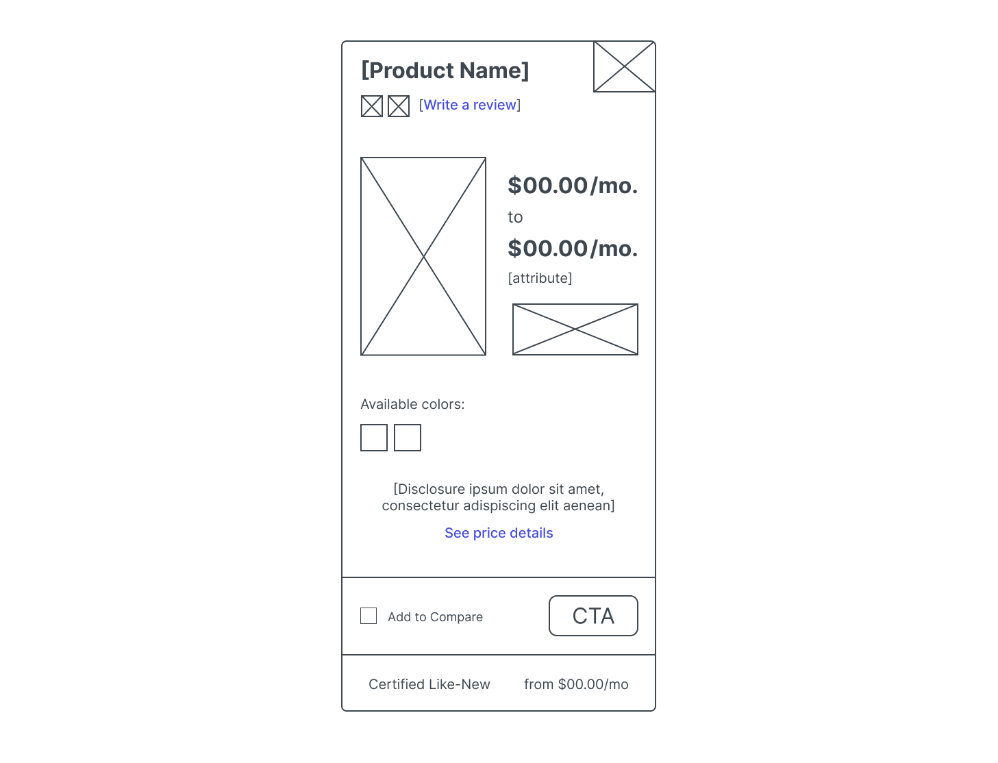
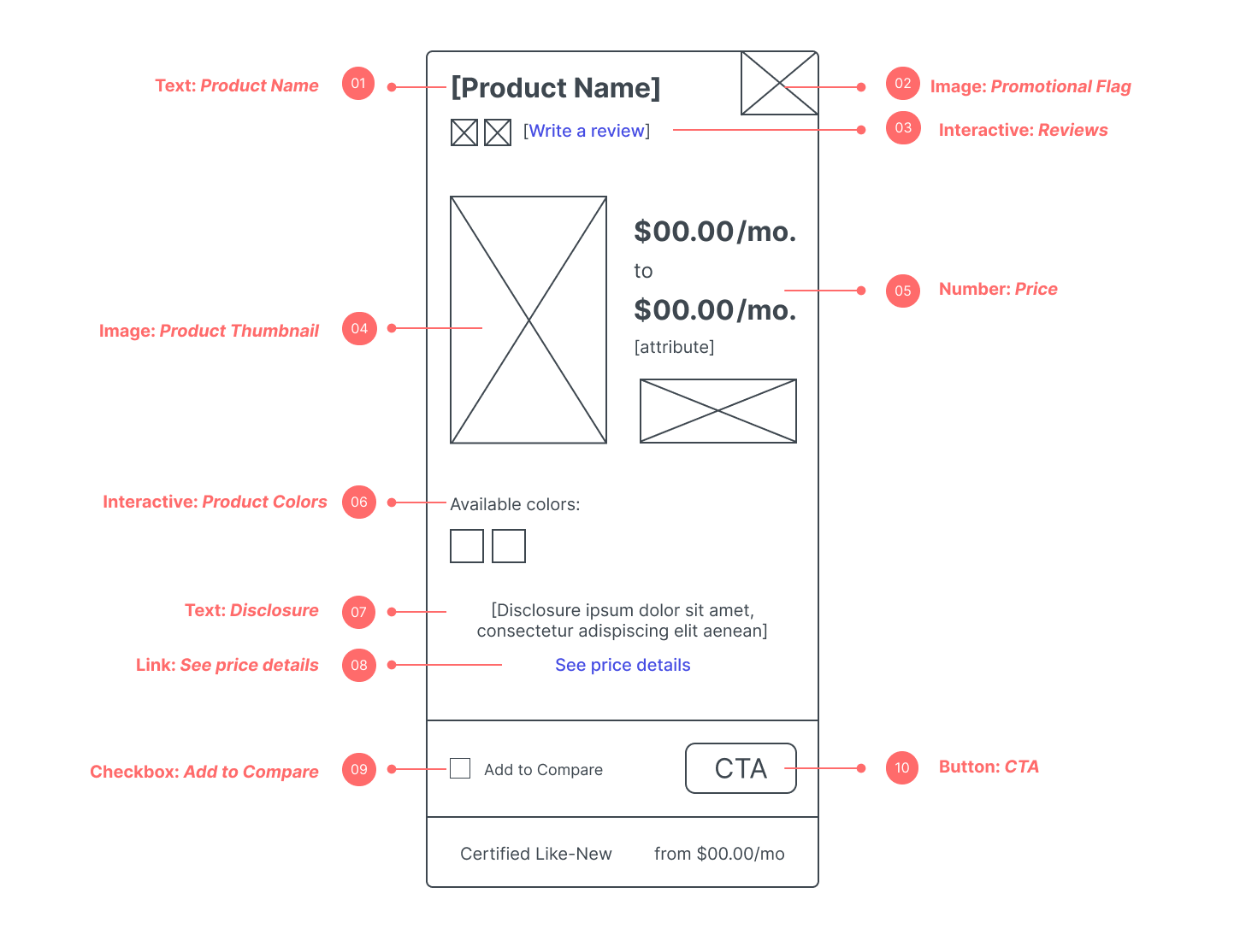
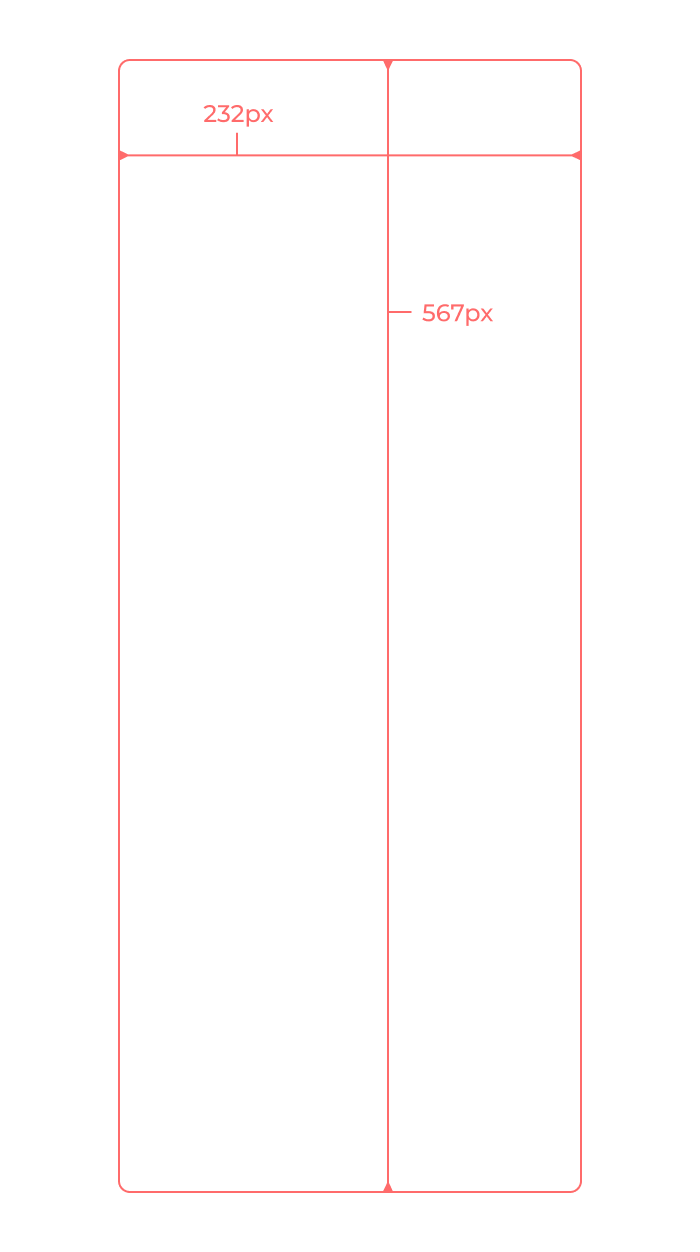
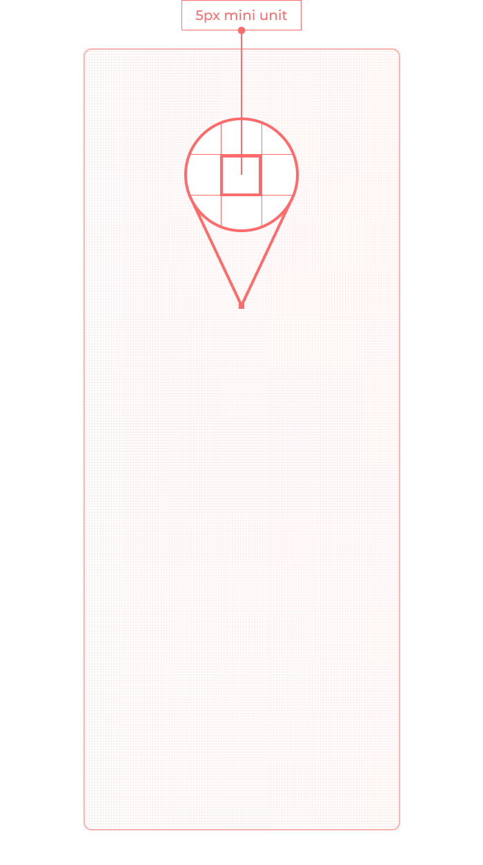
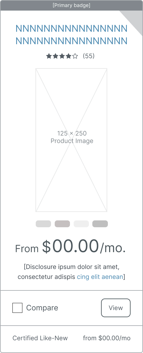
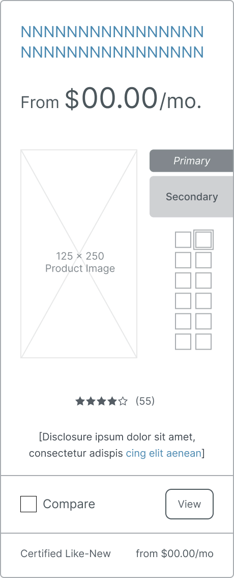
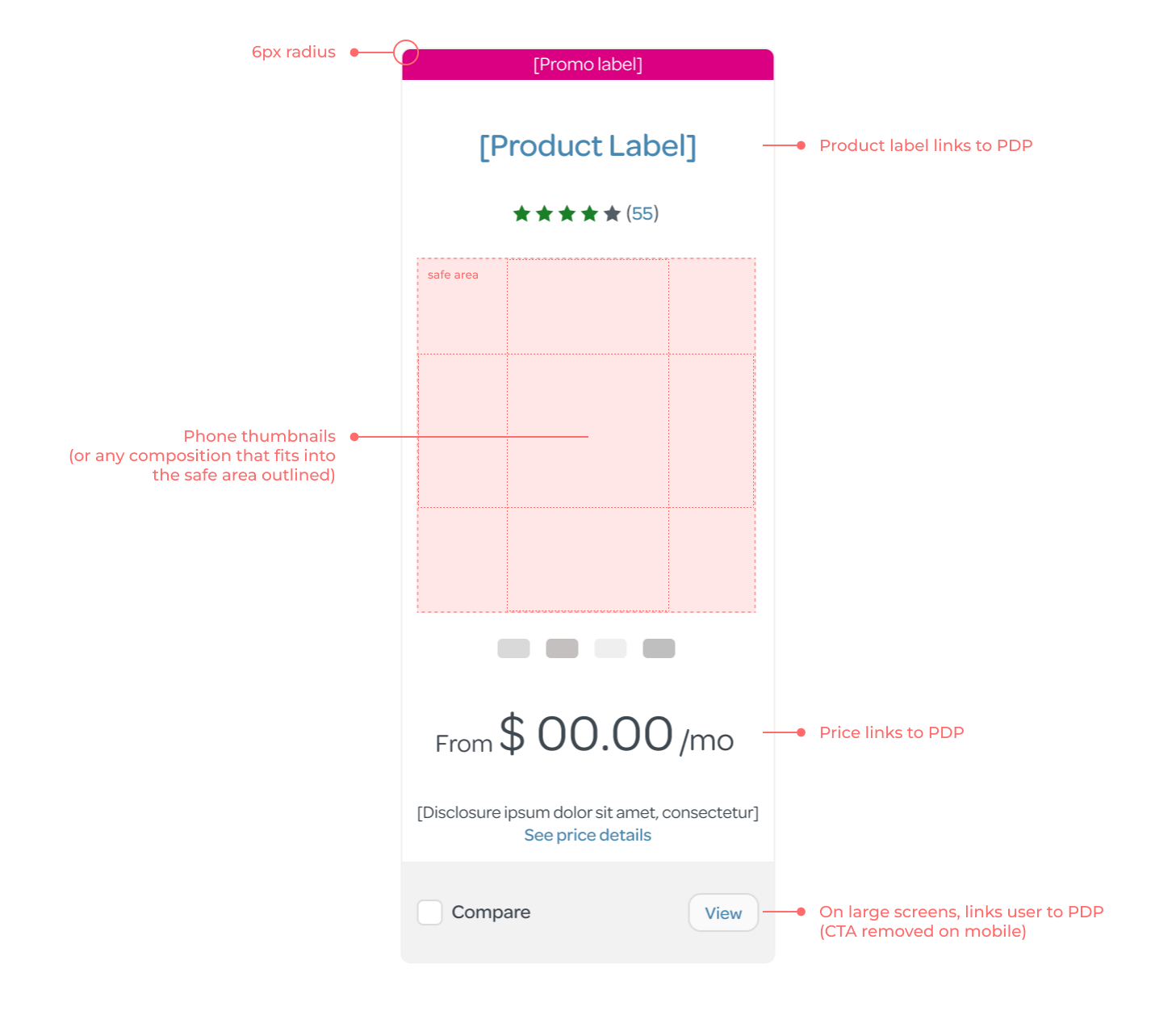
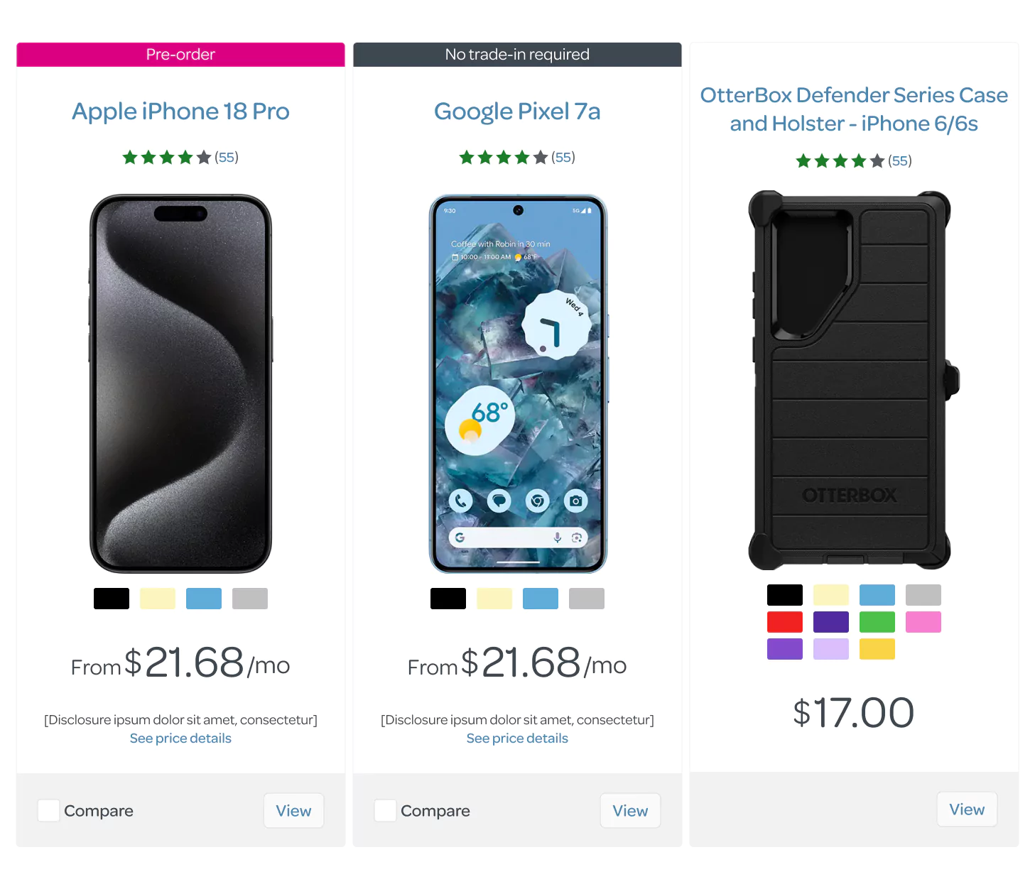
Enterprise Design Standards
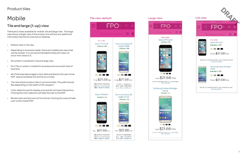
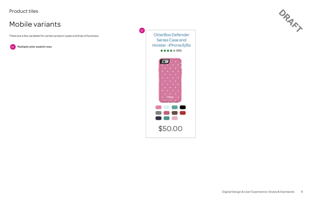
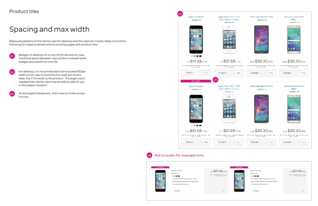
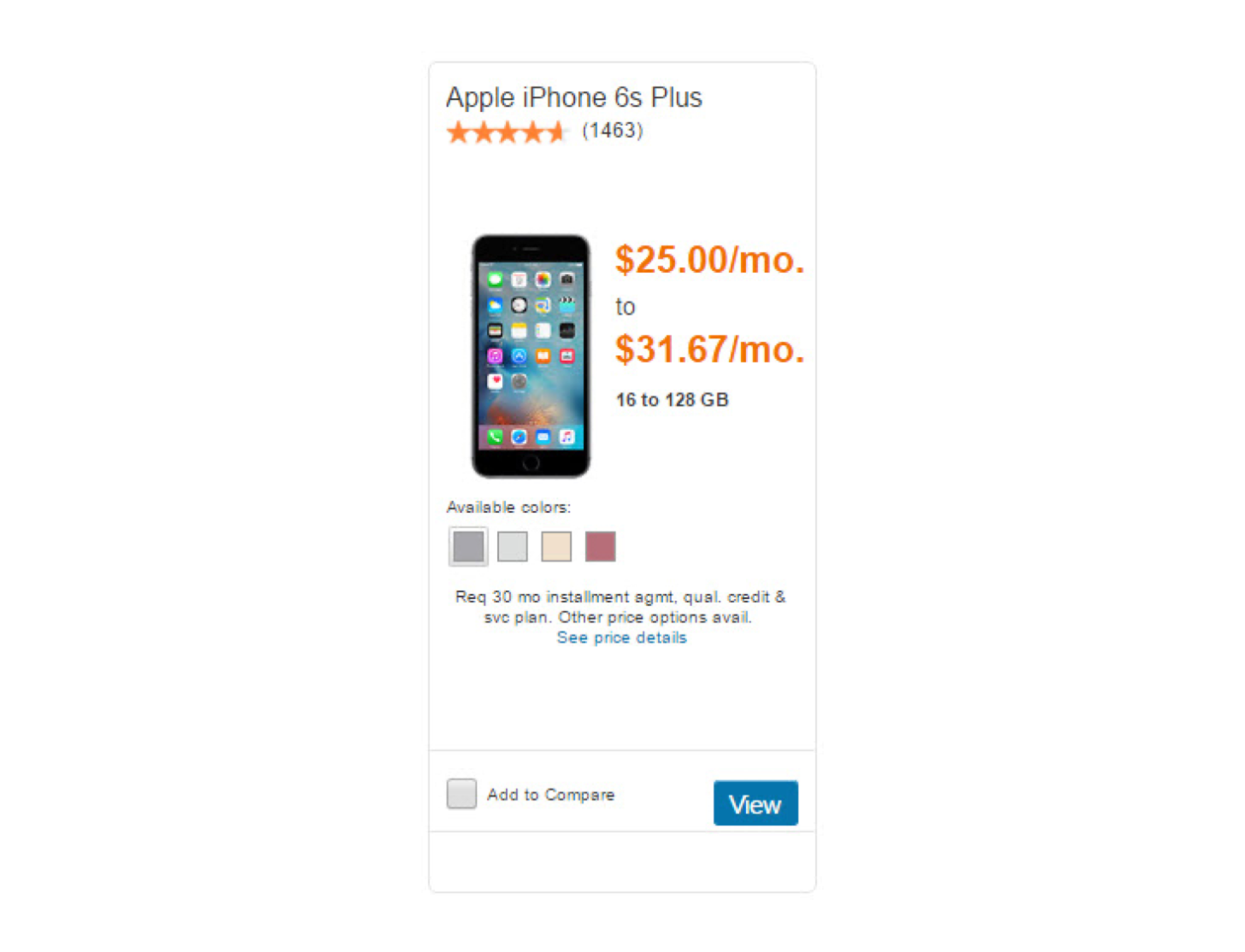
Ultimately, the design iterations I brought to the table inspired conversations and collaboration across different teams including engineering and accessibility. Our collective efforts eventually informed the enterprise design standards for this critical component supporting this high volume eCommerce funnel.